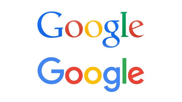
Typography is an important part of logo design, impacting the overall look and communication of a brand’s identity. Fonts may represent a variety of emotions, attitudes, and personalities, so choosing the proper typography for your logo is vital. In this post, we’ll look at the art of typography in logo design and offer suggestions for selecting the correct typefaces.
Understanding Typography for Logo Design
Typography is the style, organisation, and look of text, including font selection, size, and spacing. Typography is a critical aspect of logo design since it helps portray the personality and values of the company. Whether strong and modern, elegant and refined, or fun and whimsical, the appropriate font establishes the brand’s tone and generates a memorable visual identity.
Choosing the Right Fonts
When choosing typefaces for your logo, you must consider various things to ensure that they properly express your brand identity. Here are some recommendations for selecting the proper font:
1. Reflect your brand personality.
Choose typefaces that express your brand’s personality and ideals. For example, a luxury company would use exquisite serif typefaces, but a tech firm might select clean and contemporary sans-serif fonts.
2. Consider legibility.
Prioritise readability to ensure that your logo is simple to see and comprehend, especially at tiny sizes or from a distance. Avoid highly ornamental or styled typefaces, which may reduce readability.
3. Balance fonts properly.
To achieve visual harmony, balance the multiple typefaces in your logo. Pairing a strong, eye-catching typeface with a simpler, complimentary font can result in a dynamic and balanced composition.
4. Limit the number of fonts.
Limit the number of typefaces in your logo to prevent visual clutter and misunderstanding. To preserve cohesiveness and clarity, use no more than one or two typefaces.
5. Try out other options.
Experiment with several fonts to find the best one for your brand. Examine how fonts appear in different sizes and formats to ensure they retain their impact and readability across several apps.
Avoid Overused or Generic Fonts
Avoid employing overused or generic typefaces that lack creativity and risk diluting your brand’s identity. Select unique or custom fonts to let your logo stand out and leave a lasting impression.
Working with a Logo Design Company
Choosing the proper typefaces for your logo is an important step towards developing a memorable and successful brand identity. If you’re not sure which typefaces to use or how to effectively use typography in your logo, consider working with a competent logo design company. These experts have the knowledge and creativity to help you choose typefaces that effectively represent your business and appeal to your target audience.
Conclusion
Typography is an important part of logo design, impacting the overall appearance and feel of a brand’s identity. Choosing the proper typefaces allows you to successfully represent your brand’s personality and values, resulting in a distinctive and compelling logo. Whether you choose classic serif fonts, modern sans-serif fonts, or custom-designed typefaces, the art of typography in logo design is critical for producing a brand that stands out and leaves an impression. With the aid of a reputable logo design firm, you can guarantee that your logo typography matches your brand identity and helps you reach your branding objectives.
